With the increasing complexity of projects, a modern manager’s skill set includes the ability to visualize complex data sets. One tool that has simplified this task is the gauge chart. Unraveling the power of data visualization, gauge charts have found practical applications in various fields including project management. Keep reading to discover the utility of the gauge chart in managing and monitoring projects.
Understanding Gauge Charts: An Essential Management Tool
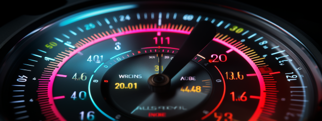
Gauge charts, also known as speedometer charts, are circular displays of data that are often used to visualize key performance indicators (KPIs) or other essential metrics. Charts like these make complex data readable and understandable, with colors often used to indicate performance levels.
A gauge chart visually indicates a value within a defined parameter – similar to the function of a car’s speedometer. The data representation makes it easier to monitor the fluctuation or the static nature of the values over a specific period.
Familiarizing oneself with what is a gauge chart is essential for effective data representation and interpretation. This tool offers a concise, visual representation of data, making it a perfect component in a project manager’s toolkit.
Ultimately, gauge charts simplify the process of tracking, monitoring, and interpreting complex data sets, thus aiding in the decision-making process.
The Role of Gauge Charts in Effective Project Management
In project management, gauge charts play a significant role. They are versatile tools often used to monitor project progress or evaluate overall project performance. They can provide quick visual insights into where a project stands against its preset benchmarks or KPIs.
Gauge charts can represent a vast range of project data, such as budget utilization, timescale adherence, or resource performance. This versatility makes them a handy tool when it comes to complex project management.
Moreover, gauge charts also encourage transparency. Data visualization helps in presenting a clear picture to stakeholders or team members, promoting mutual understanding of the project’s status.
The utility of gauge charts extends to identifying bottlenecks in a project, enabling preventive measures to defy the potential threats to successful project execution.
Key Features and Composition of a Gauge Chart
Gauge charts are composed of various parts, which together portray an entire scenario. The main features include a score (current value), a color range (often color-coded based on the performance level), a scale, and a target value. These parts work in conjunction to form a comprehensive picture of a given scenario.
One distinguishable feature of gauge charts is the color-coding system. The colors, usually arranged by gradient, indicate the performance level. The meaning of these colors can be customized according to the metrics being visualized.
The current score displayed signifies the actual value the project possesses, while the target score represents the desired value. Therefore, the chart is a continuous, real-time indicator of progress towards the target.
The most compelling feature of gauge charts is their simplicity and clarity despite the complex data they represent – making them an invaluable tool in project management.
Illustrating the Practical Applications of a Gauge Chart in Project Management

The spectrum of practical applications for gauge charts in project management is vast. From monitoring project progress to displaying financial data such as cost performance index (CPI) or even comparing expected and actual outcomes, these charts prove to be immensely useful.
For instance, in the case of a project tracking KPIs like cost or time, a gauge chart can be deployed to visualize and monitor these values against the defined threshold. This allows project managers to take immediate corrective actions if the project veers off its intended path.
The gauge chart not only excels in monitoring internal performance metrics but is also efficient in conveying this information to stakeholders. It helps provide stakeholders with a clear, at-a-glance understanding of the project’s performance against its targets.
In essence, if there’s a need to depict progress towards a certain target in project management, gauge charts can be a suitable solution.
Altogether, gauge charts are valuable tools that can empower project managers to track, analyze, and visually communicate project performance. They encapsulate various features into a simple, powerful visual, making any project management task markedly more navigable.