12 Things To Look For In A Good Flow Chart Example

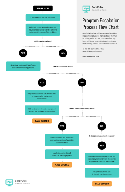
There are a lot of write-ups online that feature examples of flowcharts. These things can be helpful to a lot of people, especially those who find themselves making a flow chart from time to time.
A good flow chart example makes all the difference in how someone perceives your message and what they end up getting out of it. Keep these things in mind when you are looking for good flow chart examples.
1) Consistency of Flowchart Symbols
Make sure that any arrows or lines you draw point in the same direction. If they don’t, it will only confuse and make your flowchart seem flawed. Consistency is especially important when you include words on your chart as well as images of things like directional indicators. It’s also a good idea to keep all of your arrows relatively the same size.

2) Good Punctuation
Flowchart creation software often includes tools that allow you to include words on your charts. These are helpful, but if you can’t use good punctuation, it will only cause confusion and make what you’re trying to convey even harder for people to understand. Your flow chart should make sense.
3) Colors Only When They Add Something
Color can be used to make your flow chart template stand out and catch people’s attention, but it should only be used when it adds something. If you color everything in sight, it will just look cluttered and messy and may even cause someone to stumble if they’re color blind or see colors differently.
4) Keep The Workflow Diagram Simple & Concise
Keep your flowchart’s message clear and concise so that it is easier for people to get the idea you are trying to send across. You don’t want a lot of extra information or any unnecessary words on there because it will only serve to confuse things further down the line. Imagine using a brochure maker so you can prioritize necessary information that should be found inside that piece of paper.
5) Stay On Topic
Your flowchart should be about one thing and nothing else. Don’t add things to it that aren’t necessary or relevant because they will only distract people from the message you are trying to get across. A flowchart is not a bucket list; don’t try and make it into one.

6) Make It Easy To Follow
You want your flowchart to be easy for people to follow, which means that you need to use things like arrows and directional indicators properly. These are there for a reason. Don’t put them anywhere they don’t belong or dress them up in any way that will make it confusing as to where they go and what they do.
7) No Harsh Angles (i.e.: Walls)
Make sure that your angles are gradual and smooth, not harsh and jagged. It should be easy to follow the path of the flowchart without having to wonder whether an angle will lead somewhere or just stop short and leave someone standing there confused. You can use a flowchart maker to help with this.
8) Keep Connections Clear
When you are drawing flowcharts, keep the connection points between two images clear and well defined so that people can follow them easily. People shouldn’t have to guess where one thing stops and another begins or go off on a wild goose chase trying to figure out where something starts or ends.
To view some examples of flow charts that keep connections clear, visit Venngage.
9) No Blurry Images
This is fairly self-explanatory. The images and words you use should be clear and easy to understand for your flowchart to be effective. If they are blurry, people will not be able to read or make them out properly and things will get misconstrued very quickly.
10) Don’t Overdo The Text
Words are great, as long as they’re used in moderation. Don’t try and put too much text on there or make it cluttered because people will get lost and won’t be able to understand what you’re trying to show them. Keep your words simple and make sure that they don’t overshadow the images and pictures you’re trying to share.
11) Don’t Be Afraid To Test It Out
Put your flowchart through its paces and make sure that it flows properly before you go sharing it with the world. If something is not working, fix it or get rid of it. While you might think something is working when in fact it isn’t, it could lead to some major issues down the line.
12) Make Sure It Can Stand Alone
If the flowchart you created is not stand-alone, meaning it needs to be viewed alongside other things for people to understand what’s going on, then it’s probably not very good. If this is the case, try and work with your software or whatever program you are using to fix it so that it can stand on its own.
Bottomline
Keep these things in mind when creating flowcharts and you should be fine. If you get stuck, it’s always possible to get some help from a friend or just by looking around the internet for examples that you might be able to use as a template.

